MA Summer Show Installation Views

Posted here are some installation view pics from my MA final show, 16-22 July 2015. It comprised of three distinct but related bodies of work: 

Firstly, a set of five mounted digital giclée prints (23 x 15 cm) which were casually displayed on a shelf, installed in a corridor alongside the main exhibition space. Although in five parts it should be considered one piece, or a ‘pentaptych’, and was titled Queens Road to New Cross. Each showed a photographic ‘bokeh’ shot, taken while travelling on the top deck of buses from Camberwell to Lewisham at night. They have then been digitally-manipulated using just three processes: firstly made negative, and then levels, hue and saturation have been adjusted. They are simultaneously familiar and mysterious. At first they may appear as abstract paint or ink blots, or maybe microscopic photography of bacteria? The print showing the ‘open’ sign offers slightly more clues. My aim was to uncover the inner ethereal beauty of what some might consider somewhere just to pass through - or at worst, an urban eyesore.

Secondly, a set of seven assemblage pieces. Again, although strictly these are separate objects, I was presenting them almost as one piece by placing them so close to each other. As I've said elsewhere, 'I use found objects, materials and images taken from the urban environment. Revealing the overlooked visual qualities of these apparently mundane subjects, I aim to validate the intrinsic aesthetic worth of the inner city'. There should be more detail on each piece in elsewhere in this blog...

Adjacent to the assemblages were displayed nine digital giclée prints, which were arranged into three sets of three, or triptychs. They were sized aprox. 40 x 40 cm and 62 x 40 cm; mounted onto a rigid foamex board and printed with a semi-gloss finish. Each showed a digital photomontage itself using three images all taken from the local urban environment. Again, more detail is to be found elsewhere on this blog...

The Cohort

Below are some portraits of my fellow students in the graduating class of 2015, in front of their own work in the final show. I intended to include one of everybody – apologies for missing Ally and Andy – and for only getting a shot of the back of Jojo's head!

Ruby

Gigi

Jojo

Emily

Sila

Harmeet

Jake

The Power of Three

Aside from my body of work creating assemblages from found and other materials (such as tape and spray paint etc) I have continued a photographic practice that remains important to me. Since my final tutorial with Jonathan at the end of May, I decided to postpone the idea of trying to present this work in lightboxes, and instead ‘focus on content’ as Jonathan put it. 

In some ways this is a disappointment, as the particular technique I had in mind - of using changing coloured LED lighting, and printing each image layer on a separate piece of translucent film - could offer some original possibilities. However, it could also present substantial technical challenges and would probably require extensive testing and experimentation with different construction and printing methods. It could also cost a lot to produce. Jonathan was concerned that I could get bogged down on these on these technical challenges at the expense of content. Given the amount of time left I decided to fall back on ‘plan B’ and present this work more simply as digital prints. (I definitely still intend to pursue ‘plan A’, post-MA.)

I spent just a few more days taking new photos, focusing closer on my immediate area. I added these to a large collection of others I had selected. Although I have many similar shots I have taken over several years, I decided to mainly use newer ones I had taken since the start of the MA. I also decided to complete nine separate pieces to a ‘finished’ standard, although these were to be presented as three groups of three, echoing my earlier research into historical triptychs, such as The Garden of Earthly Delights.

[ More text to follow ]

Unit 2 Assessment

1. Present, in the final exhibition, a resolved body of creative practice that has evidenced the systematic enhancement of your knowledge and understanding.

I have completed the installation of my final exhibition on schedule. I am presenting a resolved body of work that specifically addresses my project proposal – summarised in the question ‘What is the visual language of the inner city’ – and which responds to the research I have undertaken during the MA.

In particular my work demonstrates confidence in a range of materials and processes. These include assemblage, photography, print and paint (specifically stencils and spray paint) – complemented by various digital media.

I also explicitly wanted to show how different approaches to the ‘clarity’ or ‘mystery’ of a work’s meaning can coexist successfully within an artistic practice. I am interested in how viewers understand the work and bring their own interpretation to it - and how this relates to broader issues of accessibility and elitism in the arts. With every piece I have considered, from the outset, how it might be perceived and understood by the viewer.

I have also evidently addressed contextual and social issues in the work – including urban decay, development and housing; violent crime, policing and civil liberties; national and cultural identity etc.

2. Analyse and reflect coherently upon your own practice and its context in both written and verbal forms.

This has been done on my blog; in the video made for symposium 2; as well as during face-to-face contact with staff and students. This is also further elaborated below…

3 (a). Summarise your overall progress (‘evaluate your practice over the 2 years on the course’)

I have found the course interesting and rewarding in many ways, but also very challenging. When I started I had a 13-month old daughter and was working full-time, running my own design business, which is often demanding and stressful. I knew it would be challenging, but I think I underestimated how difficult it can be to find (make?) the time to study alongside childcare and work commitments. I understand better now how making successful art consistently takes time, commitment and money. Despite this I have made some development in my understanding of the creative process, particularly in relation to spontaneity, and allowing materials to direct the work.

I began this course not really considering myself a genuinely practising artist, but as a graphic designer who only occasionally would produce self-initiated projects. I had a strong desire to develop and apply my creative skills for my own work, rather than just for clients. I feel that I have now made significant progress towards this.

3 (b). Formulate a constructive plan for continuing Personal and Professional Development (‘outline some ideas for your future development and what you will do after the course’)

My blog has been presented more as a professional artist’s website rather than just a student blog. This is not disingenuous but intended to help facilitate my professional development immediately after graduation. Sometimes, I think of most of my pieces as just a starting point – as proposals which could be developed, possibly into into a series. I fully intend to continue making work and am currently applying for exhibitions such the ZAP Open and the Deptford X Fringe, as well as considering other opportunities, especially for recent graduates.

In terms of media and skills, I realise that in some ways I have remained in my comfort zone for my final projects - although I feel I definitely have a deeper understanding of them. I now want to explore more fully certain media and processes that I only got an introduction to on the course. These include video, animation, interactivity, projection mapping, Processing, public installation, social engagement/participation. I want to make new work which is more sophisticated, subtle, complex, spontaneous, abstract and ambitious in scale and scope.

As with most students, there have been some compromises in what I set out to do - particularly my ideas for making lightboxes. These compromises have been made mainly due to time and cost constraints and I keen to develop them when possible.

Part of the reason I wanted to do the MA was also because I want to teach more and I will continue to pursue this in various ways. I’m considering doing a Postgraduate Certificate in Higher Education next - and perhaps in the longer term, a PhD. I also want to fully explore how to apply what I have learned into my design practice, especially regarding the creative process.

Symposium presentation

Below is a video presentation given to an online symposium on 1 June 2015, focused on research and showing how my practical work has been contextualised by my wider research. Following the video is also a transcript.

I began this MA with many different ideas but focused my project proposal on the question: what is the visual language of the inner city?

I wanted to reveal the visual qualities of this subject area – such as utilitarian or decayed objects – which might otherwise be overlooked as mundane or ugly; and to validate the intrinsic aesthetic worth of the inner city.

I’ve worked with various media and processes – including installation, painting, printmaking and photography – and used found objects, materials and images taken from the urban environment.

This reflected my personal situation as a long-time resident of inner London, but more importantly, I sought to develop a practice that was also outward-looking and ‘exoteric’ – defined as ‘relating to ‘external reality’ as opposed to your own thoughts or feelings’. Increasingly, I understood how this relates to artistic practice described as ‘socially engaged’. 

This was developed in my research paper which was titled: ‘The art of the inner city as a socially engaged practice: a comparison of works by Robert Rauschenberg and Cornelia Parker in relation to Guy Debord’s concepts of psychogeography’.

The paper outlined different approaches to artists’ social engagement. The first, and perhaps most common, use of the term refers to projects involving public participation in their production – such as the Field series by Antony Gormley; or Sunflower Seeds by Ai Weiwei. I also looked at online participation projects like Smilesfilm by Yoko Ono.

I then examined community arts projects such as the South London Gallery’s Shop of Possibilities; and public art installations like the Art Everywhere billboard project; as well as work by practitioners such as Thomas Heatherwick and Greyworld.

This was contrasted by work with an overtly political message [political art] such as Picasso’s Guernica and The Spear by South African artist Brett Murray (which was defaced when exhibited).

I also explored how social engagement can be understood as increasing and widening consumption of the arts in general, one of the key aims of the Arts Council of England; and I briefly addressed the problems of authorship and quality in participatory projects.

This led to the question of how else might artists – who may not have the resources or desire to recruit volunteers – create socially engaged work?

An alternative strategy is for them to seek source material from their immediate surroundings and by implication, their own social context (rather than focusing inwards on individual or purely aesthetic concerns).

The inner city as a site to conduct such practice is not just relevant to those resident there – it becomes more so as the global population continues to shift from the rural to the urban. Typically characterised by an intense concentration of diverse peoples, materials and environments, inner cities also offer unique opportunities as a source of inspiration for artists living in them.

One such artist was Robert Rauschenberg who, emerging in downtown New York in the 1950s, said, ‘I wasn’t interested in attaining a precious state of isolation [but] in what was around me’, and, ‘I want my paintings to look like what’s going on outside my window, rather than what’s inside my studio.’

His 1950 collage Mother of God was an early example of Rauschenberg’s inventive use of found materials and his shift away from abstraction – and it prefigured his belief that anything could be art. This was developed in his series known as ‘combines’, such as Black Market (1961) which included newspaper, print, wood, metal, clipboards, a license plate and a road sign. I have also created work out of seemingly mundane materials, such as these [example shown] made from PVC electrical tape.

As Rauschenberg said, ‘Everything starts out on the street and New York was, I thought, so incredibly rich in materials that whenever I started working, instead of going to the paint store or any place else, I would just walk around the block’. With this piece [example shown] I moved on from painting images of road signs to collecting and using the real thing.

The act of walking in one’s locality as a creative methodology is formalised in the theories of Psychogeography, defined by its protagonist Guy Debord, as: ‘the study of the effects of the geographical environment on the emotions and behaviour of individuals’. 

This was practically elaborated into, firstly, the concept of dérive (meaning ‘drift’) involving a journey through a city without a planned route. As Merlin Coverley said: ‘the street-level gaze that walking requires allows one to challenge the official representation of the city by cutting across established routes and exploring those marginal and forgotten areas often overlooked by the city’s inhabitants’. I originally took these digitally-manipulated bokeh shots while drifting through the city.

The second key psychogeographical concept is détournement (meaning ‘rerouting’ or ‘derailment’) and involves the appropriation of signs, images, text or media of the capitalist system and subverts them, turning an oppressive culture against itself. And these pieces [example shown] might owe something to this approach.

A contemporary artist who also arguably uses these methods is Cornelia Parker. She said, ‘I was brought up in the countryside and was pretty phobic about urban spaces, but now I live in London and I don’t think I could ever leave. It’s just continually throwing up stuff that I love. I left home and went to a gritty urban space. It had urban blight. My aesthetic changed, I began to look at decay as something that possibly could have value.’ I created these multilayered montages [example shown] partly in response to my own fascination with decay.

Parker’s 2013 works, Pavement Cracks: City of London were made by creating a rubber mould from cracks in the pavement, which are cast in bronze, before being finished with a black patina. These pieces are effective in that they resemble the original cracks as well as a street map – offering a simultaneous micro and macro view of the city.

Prison Wall Abstract: A Man Escaped is a series of 12 close-up photographs of Pentonville prison wall, which Parker took as builders were repairing it. She responded to them because, to her, they looked like Abstract Expressionist paintings.

While both Rauschenberg and Parker are multifaceted artists whose prolific work is not confined to the urban, they nonetheless offer valuable examples for inner city artists seeking new ways to develop a socially engaged practice.

Union Hack

Before making this piece I had been thinking about creating an artwork based on the union jack flag for some time. Although I am almost completely without patriotic sentiment – and find problematic associations of the British flag with the far right, colonialism, monarchism etc – I have to admit to actually liking it’s visual qualities. As a designer, I find all world flags fascinating – as symbols packed with meaning that operate as national brands. However, the union jack, as a superimposition of three distinct flags, has a striking dynamism in it’s composition that’s quite unique (eg. compared to the tricolours of France, Germany, Italy, Ireland etc).

UH3.JPG
UH5.JPG
UH2.JPG

I have used the flag previously as a device in various design jobs, such as for citizenship education, the Hansard Society, as well as this book cover for Pluto Press:

Asians in Britain book cover

I tried experimenting with the flag’s colours and forms creating variations such as this:

Multicoloured Union Jack

It was then I remembered another material that I had been intending to use. I had acquired some police barrier tape a while ago, and considered combining it with stencil paintings etc – but when it occurred to me to put it together with the flag, I thought it could enrich the meaning of the piece.

I also thought that it could address some topical issues, particularly the many incidences of undercover policing that had been exposed recently and the threat this poses to civil liberties in the UK. We had also recently experienced seemingly unprecedented levels of flag-waving during the jubilee and olympics, and the union jack was increasingly creeping onto various consumer goods, like cushion covers etc. From once being almost perceived as a fascist symbol, the flag was gaining widespread cultural acceptance.

Damien Hirst’s enormous spin painting rendering of the Union Jack covered the floor of the Olympic Stadium during the opening ceremony

Damien Hirst’s enormous spin painting rendering of the Union Jack covered the floor of the Olympic Stadium during the opening ceremony

Additionally, the upcoming Scottish independence referendum raised awkward questions about the continuing relevance of the flag’s design and even the ongoing controversy over Britain’s foreign policy (and events such as the Woolwich killing) made the union jack a worthwhile subject to respond to.

There’s also something crudely satisfying about subverting what some consider a precious national symbol. This also reflected research I had been doing into the psychogeographical concept of détournement (‘rerouting’) - the appropriation and subversion of the signs, images and media of the dominant culture. 

Having said all that, I felt the final design maintained enough ambiguity to still allow personal interpretation by the viewer. I created several different mock-ups before settling on a final version using metallic silver tape for the background (and in this way at least, digital media was an essential part of the process.)


I knew that I wanted to accurately conform to the official version of the flag, as it is “quite intricate, and often drawn incorrectly” as Julian Wiseman says in this excellent article. This meant that the width of the police tape would determine the overall scale of the finished piece, ie. it should be as close as possible to 708.49 x 353.26 mm in total. 

UnionJackConstruction1.png

I initially planned to order a custom-made canvas, but the cost and lack of accuracy was off-putting. So I basically constructed a box out of timber and MDF in the college’s 3D Resource Centre. (After making the box I was surprised by the actual proportions of it.) I decided to make it quite deep, about 75mm, not only to match my previous Attention Seeker canvas – but also to give it depth, presenting it as a three dimensional object and emphasising the act of wrapping and enclosing the tape around something. The pictures below show the various stages of production, and I completed the piece in time to display at the MA interim group show.

I titled the piece ‘Union Hack’. On one level this is quite a basic play on words, but one which was so obvious I thought I should just go with it. (Some definitions for ‘hack’ include: “a clever or elegant technical accomplishment, especially one with a playful or prankish bent”; “modify or change something in an extraordinary way” and “to modify, repurpose and customise”.)

In reflection, I feel that overall the piece was successful in achieving what I set out to, and I wouldn’t change much in the production of it. My concern is that it may be read in a superficial way as a shallow gag, or a naive juvenile protest. In practice however, I have generally had a good reaction to it and when presented at a group session it provoked an interesting and wide-ranging discussion about national symbols and identity etc.

Bus Bokeh and Boredom

As an inner London resident there is little point owning a car. The logistical, economic and environmental problems and costs of congestion, parking, charges, fuel etc generally outweigh the benefits for me - so I walk and cycle and use public transport a lot. These images have been created on or while using the bus and train.

The first set were taken on the double-decker bus as I returned from the MA show at Chelsea (the number 36 to Lewisham). I think when you’ve just seen a lot of art it can help you see the everyday world from a different perspective. I love to sit on the top deck, at the front of the bus - and always do so whenever possible. It provides one of the best views of the city which, even after around 20 years, I never tire of.

As the evening fell I got out my camera and had an idea. I’ve also always loved the photographic ‘bokeh’ effect ("the way the lens renders out-of-focus points of light”) - but never tried to create them myself. This is nothing new and you see it all the time on TV etc, but I just wanted to experiment with it. I really like the way it is familiar and recognisable as well as abstract. Increasingly, I found that de-focussing and zooming the camera as much as possible created the best effect.

After some minor processing in Photoshop I tried inverting the images into a negative and preferred these versions, which made them more abstract - and looked almost like microscopic images or ink blots.

The second set was taken on the bus from Camberwell to Lewisham. It was raining, the roads were jammed and what should have been a 25 minute journey ended up taking about an hour and half. I didn’t have anything to read and didn’t bring my camera, so was going out of my mind with boredom (I get bored very easily!) I pulled out my mobile phone and passed the time taking snaps of the window and how the effect of street and traffic lights interplayed with the rain etc on the window. The camera on my phone isn’t very good, but I found that some of the coarse pixellation etc almost added to the effect. I also later made these negative for the same reasons stated above - and quite liked the delicate, painterly quality of the images.

This third set was taken while waiting for a train at London Bridge station after visiting the White Cube gallery. There is this large perforated steel box on Platform 1 (no idea what it’s for.) By manually switching the focus on my camera I could achieve some interesting layering effects that, to me, resembled the moiré pattern of halftone printing - or even of Islamic architecture? I only had about two minutes until my train arrived, so I would like to return to the site to take some more photos…!

Unit 1 Assessment

Learning Outcomes: ‘Develop your Project Proposal to plan a challenging and self-directed programme of study’

• My original Project Proposal was developed in April, as detailed on the blog here. It has since been further developed as shown in my Mid Point Review presentation. I’m continuing work on it, and am currently drafting a new work plan for the remainder of the course.

‘Demonstrate a critical engagement with practice-based research and contribute actively to debate and discussion’

• During Unit 1 I have worked on around 6 or 7 main pieces – these are mostly finished, or nearly so – these are documented on the blog here and here . I’ve also gathered a variety of materials for use with these or future projects.

•  I have simultaneously continued a practice in photography – mainly from around the urban environment, as shown in the MPR etc. These have been mostly gathered for later application.

• I have taken part in almost all the online chat sessions - and have attempted to make generous contributions to the discussions, (encouraging a ‘brutal honesty’ from other students in the group!)

I have attended a number of other events at the college, including:

• The Mid Point Review for full-time students; as well as the symposium with full-time Digital Arts students and Designer Maker students; and and offered constructive feedback during these.

• Lectures at Wilson Rd and at Chelsea – and asked questions, or made comments, at most of these. These have included David Cross; John Sturgeon; Nikolai Larsen (at Chelsea); Linda Sardino; Paul Coldwell (x2); Mark Harris; Anna Bushan; Barnaby Barford; Paupers Press/Standpoint Studio; Klara Kemp Welch (at Chelsea); Ben James; Materiality (?) 1 day conference at Wilson Rd; and… Jonathan Kearney!

• Various workshops, including: Laser Cutting (for which I suggested the theme); Pure Data (with Ed Kelly); Sound (with Matthias Kispert); Letterpress; and a Printmaking induction.

• The online final symposium of the graduating students, at which I offered feedback.

• The Royal Academy of Arts Forum on ‘The Poetic Image in the Digital Age’.

• Following Jonathan’s recommendation, I met with the artist Emily Allchurch at the London Art Fair, to discuss using lightboxes etc.

• I attended gallery visits, such as to the Caroll Fletcher gallery.

• Shared tips and knowledge etc with other students by email.

• Started to organise an interim exhibition for students in our group – including approaching venues and producing a document profiling each student, showing samples of their work etc.

• Organised independent gallery visits with other students (eg. Light Show at the Hayward Gallery).

• Visited several student shows, including: 2013 MA show at Camberwell; 2013 MA show at Chealsea; 2013 MA show at Goldsmiths; 2013 show at Royal College of Art; 2013 BA show at Camberwell; 2012 MA show at Camberwell; 2012 BA show at Camberwell; 2012 MA show at Goldsmiths.

• Met with Jan Morgan at Camberwell Library.

• Helped to accommodate another student who was temporarily visiting from overseas.

• Met and got to know some new FAD students (Xia, Xavier, Russell, Harmeet, Jake).

• Learnt new skills using Lynda.com.

‘Articulate a clear understanding of the methodology and context of your creative practice in both written and verbal forms’

Research paper

• I presented my own work to rest of the student group at our first symposium, some of the work I presented is shown on my blog here.

Mid Point Review.

Works in progress

I’ve been in the 3D workshop in Camberwell recently, building a lightbox to illuminate a piece I made from found materials. I still have to fix the LED lights into it and complete a few finishing touches, but I’m pleased that it is now nearly complete. I’ve also been using the laser cutter to create a stencil for a modified road sign piece, which I’m currently titling ‘Armed Youth’. I hope to complete this one soon too. Pics below show some of the process for both of these…

Attention Seeker 2.0

Back in July I completed the final version of this piece that I’d been working on for a while. This is on canvas, whereas the previous one (effectively a full scale ‘maquette’) had been on cardboard. After that earlier experiment I decided not to include lots of ‘contrived’ drips, as Jonathan had originally advised(!) Below are some pics documenting the process, some of which show the ludicrous border I had to build around the canvas out of polystyrene etc, which enabled me to produce the ‘full bleed’ effect on the canvas. You can also see how in some areas I elected to build up heavy layers of paint with repeated applications. There are also some shots showing light shining through the canvas which gives a interesting effect, revealing the textures.

What is the social value of (digital) art?

This text was prepared to explore the general subject area that I'm looking at for my research paper. I'm very much aware that there are probably enough questions and issues here for a 30,000 word paper – rather than the 3000 that is required – and that I need to focus. The question now is where to focus – and what can I dismiss as less valuable – or has been already been covered by previous research. I'm currently thinking that my final paragraph below (in italic) might be the way to go?

Much of the contemporary art world and business is elitist and exclusive. Many feel intimidated, alienated and baffled by it. How do we extend the accessibility, affordability and relevance of art to a greater number? And how do digital media and technologies offer substantial new possibilities for addressing this issue?

Possible answers might include democratic participation in public art projects in face-to-face situations – but can also now be found online – using crowd sourcing, social media etc (eg. Katrine Granholm, Can Art Be Social? ; Yoko Ono etc). The mass reproduction of artworks as affordable prints has traditionally been seen as another solution – but how does this compare with recent ‘limited edition’ digital editions, eg. seditionart.com? How does this relate to questions of ‘the original’ in digital production? (cf. Walter Benjamin, The Work of Art…). Once we also consider the democratising potential of digital production, how does this relate to questions of ‘the professional’ (cf. Lev Manovich, The Practice of Everyday (Media) Life). How has art moved from the frame and wall, to one of interaction? (opening the work up for accessibility rather then doctrine).

Can contemporary fine artists actually learn anything valuable from mass produced, popular, commercial ‘wall art’ (as sold in stores like B&Q, Ikea, Habitat or Argos). How do such stores find or commission artists? How does their artistic value compare with fashionable, successful ‘fine’ artists? By what criteria do we make these judgements? (Presumably, a typical store’s criteria would mainly include: what sells best, what reinforces the store’s brand, market research and the personal tastes of the store’s buyers. Whereas contemporary art critics probably like to think they use a much broader criteria – including conceptual and technical excellence, originality, emotional impact, social relevance – as well as their personal tastes… but are they really so different?) How do these physical stores compare with the growing number of online art and print sellers? (On-demand digital printing means online sellers can present almost limitless choice, since they are not constrained by space as physical stores are... but do they in turn lose their editorial 'voice'?)

Can contemporary fine artists also learn anything valuable from artists such as Jack Vettriano and Thomas Kinkade – who sell so well to the general public and yet are critically slated by the art establishment? What does this tell us about ideas of class and taste? (eg. Grayson Perry, All In The Best Possible Taste). Is mass taste really conservative? If so, why? Can professional artists successfully cater to both the mass market and the fine art world of galleries and collectors? How can art be both a luxury for the wealthy, as well as an essential part of all human cultures? Is elitism such a problem anyway? How else do we achieve ‘standards of excellence’?

Social engagement is about more than just public participation. It is also about individual artists actively choosing to engage with his/her social context in their selection of subject etc. Which artists consciously and directly seek their source material from the world around them? In particular, which do so from the inner city? (eg. Robert Rauschenberg,  Jean-Michel Basquiat, Cornelia Parker)? (The inner city becomes more significant as the global population continues to shift from the rural to the urban.) How have recent phenomena such as street art affected these questions? Which artists seek to make the meaning of their work understandable to anyone? (eg. Gilbert & George’s idea of ‘Art for All’). Is there a case for ‘exoteric’ art? (“great art simplifies and makes elegant and digestible a complex, accurate psychological truth”, Alain de Botton.)

Reflection on Mid Point Review feedback

[ Responses to some of the comments I received after the Mid Point Review presentation – from the typed Skype chat session on 24 June 2013. ] Matt: “You're brilliant Lionel. I hate you.”

A lovely way to start the feedback chat – really made me ‘LOL’ (sorry). Thanks Matt! I hate you too!

Terry: “There is a wonderful positive feeling I get from this presentation, even though we are dealing with decay”

This is an interesting and unexpected comment – and one I like, because I really want to convey that there is visual interest (or ‘beauty’); humour and positivity in even the most seemingly grim and everyday things. This relates to my earlier stated aim of wanting to “question conventional notions of beauty and ugliness” (as I said in my previous project proposal).

Jonathan: “…the definition Lionel gives is that 'exoteric' is something that is understood by everyone, or at least it is intended to be understood by everyone”

Yes, but the second part of the definition is equally important: “knowledge that is outside of and independent from anyone’s experience… [relating] to ‘external reality’ as opposed to one’s own thoughts or feelings.”

Multilayered

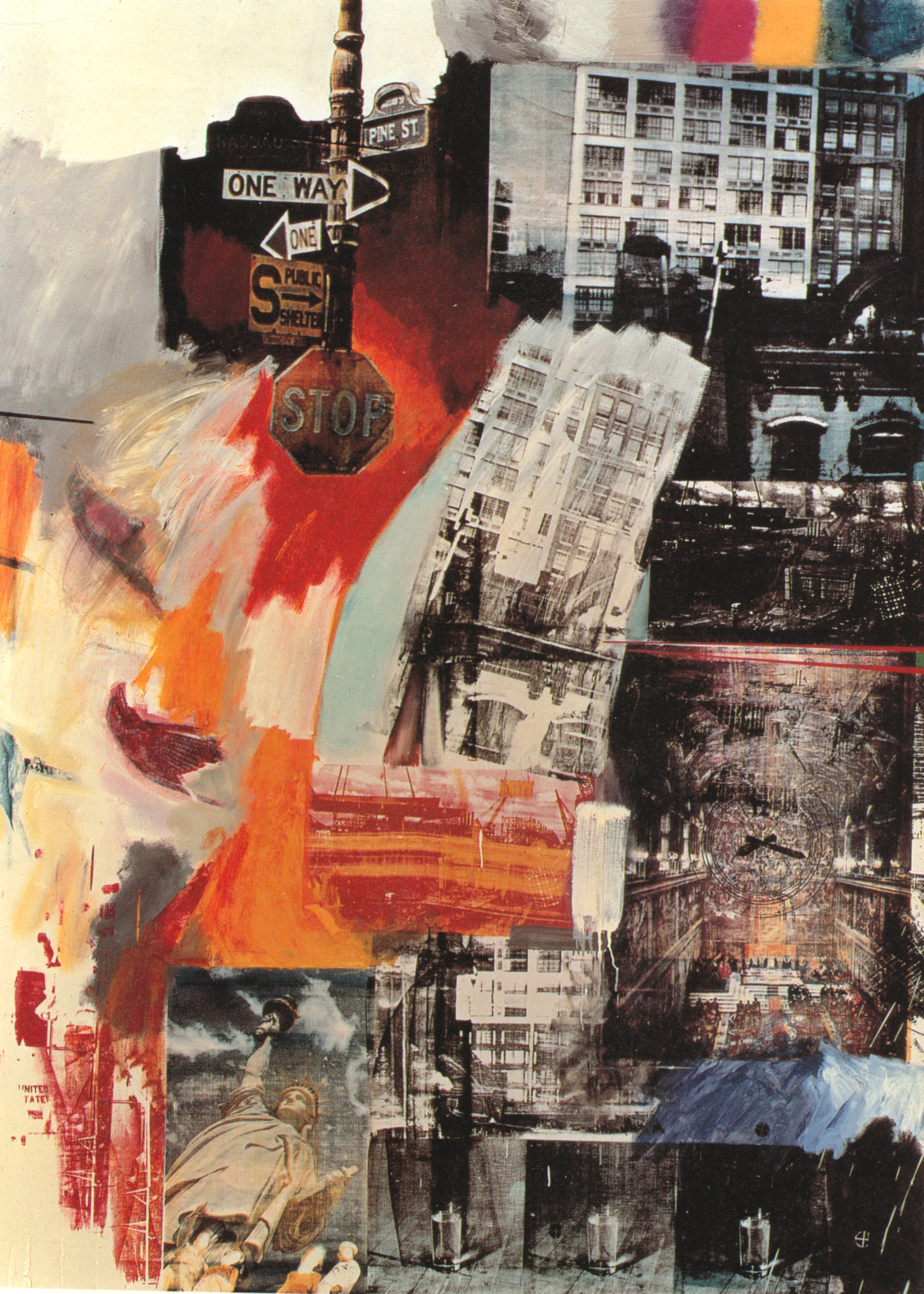
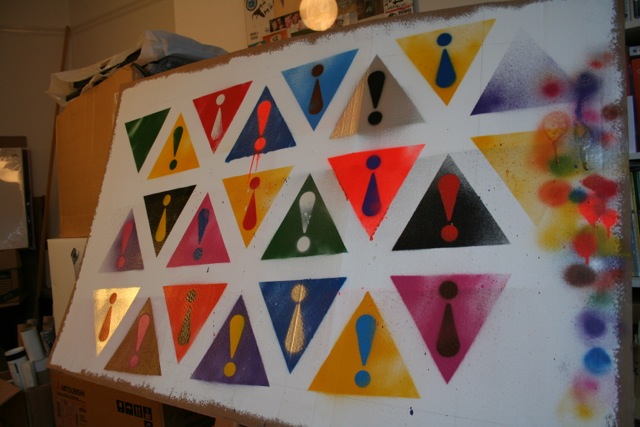
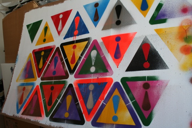
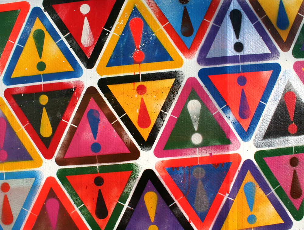
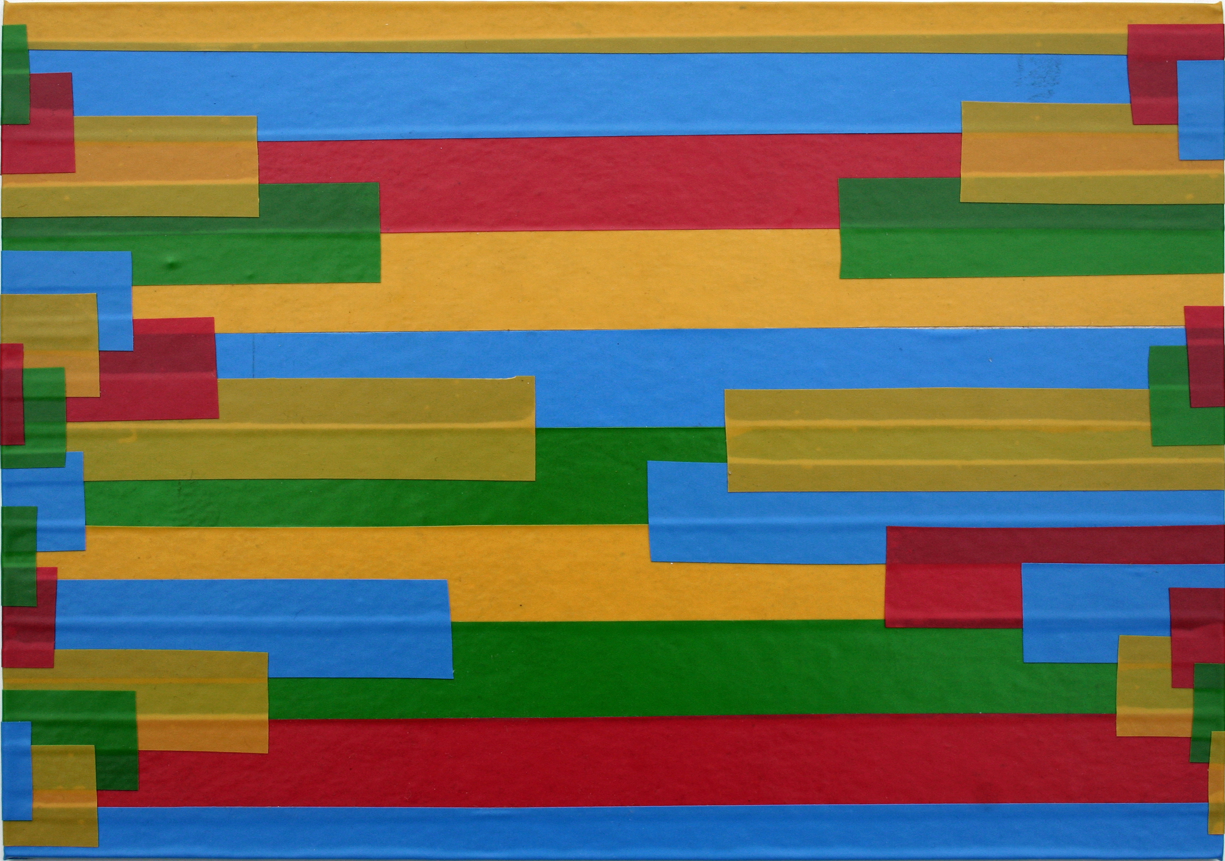
Ala’a: “I also like the multilayered images shown in the presentation, however I would like to c your own experementation”

Yes, fair point – sorry, but I didn’t feel my multilayered experiments so far had got to a presentable state yet –  they are to follow soon!

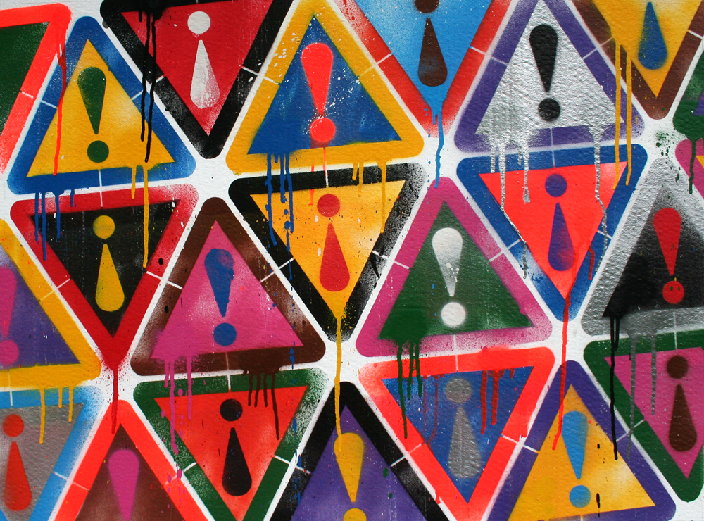
Laila: “It is very interesting how Lionel turns typical signs into symbolic art that simply shocks you and forces you to stop and think”

Terry: “I like the idea of using standard common street signs, and changing their meaning. It is a strong idea that make me take notice”

I’m pleased to get these reactions – this is kinda what I meant when I said in my earlier proposal that I “aim to make work which generates an emotional response in the viewer” – shock and humour are vital emotional responses too.

Jonathan: “…that is my fear - what is the difference between something that is 'exoteric' and just a good piece of communication design”

I’m not quite sure what Jonathan is saying here – that these kinds of works don’t really qualify as ‘art’? (If so, I’m not even sure that’s such a bad thing – again as I have said previously, “I’m particularly interested in exploring the boundaries between art and design”) – I must remember to follow this up with him!

UnionHack

Matt: “Your mock ups look fantastic too Lionel. Cant wait to see them if they're made”

It’s interesting that Matt says “IF they’re made”! I’m aware that I’m not producing finished works as quickly as I would like – and that sometimes my motivation can start to wane once the initial concept is more-or-less resolved. However, I am determined to complete making these pieces for real – and to turn that ‘if’ into a ‘when’!

Jonathan: “is there a danger here that Lionel is closing down the possibilities in the work by sticking to closely to the idea of signs?”

Maybe Jonathan has a point here, but I like Matt’s response to this question, “Is it the signs that are important, or is it just the fact that they are found objects?” I also view the signs as just part of the vocabulary of the rich and varied visual language of the inner city. (I definitely don’t want to be known just as ‘the guy who does the ‘road signs’ thing’!)

Decay

Ala’a: “there should be a difference in the content I guess Jonathan... an idea, a concept with more depth, a message…”

Jonathan: “Ala'a yes the depth is an issue -- these images are beautiful and intriguing (decay often is) but what is next, where do they go beyond that?”

These are good points that I am concerned about. I think some pieces have more apparent ‘depth’ than others. To be fair, I asked the following question at the end of the presentation: “How can I add depth and richness to the meaning of each piece?”, as well as pointing out that, “These photos aren’t finished pieces, just source material”.

I think my most successful projects involve the combination of various ideas and I hope to integrate layers of meaning within multi-layered images etc. I want to find the balance between work which has rich depth and some mystery – while simultaneously being easily understood by almost anyone (‘exoteric’) and which ‘simplifies complex truths’ (as Alain de Botton said).  I also understand that we should allow meaning to evolve during experimentation and the making process, and that it should not be too preconceived or fixed.

Matt: “…there has been a clarity in Lionel's dialogue from the beginning. I suppose however, there could be an argument that the work is too focussed?”

Jonathan: “… is it too focussed? -- I suspect the way to test this is more making, lots of tests (and failures) and let the materials themselves drive some of the direction”

I think I constantly wrestle between being ‘too focussed’ and ‘not focussed enough’. (At my last tutorial Jonathan said, "there are almost too many ideas here".) All the same, this is an interesting point, especially ‘let the materials drive some of the direction’ which, while I think I know what he means, I’m not sure I fully understand and must also follow this up with Jonathan…! (It would be good to get some examples?)

Redact

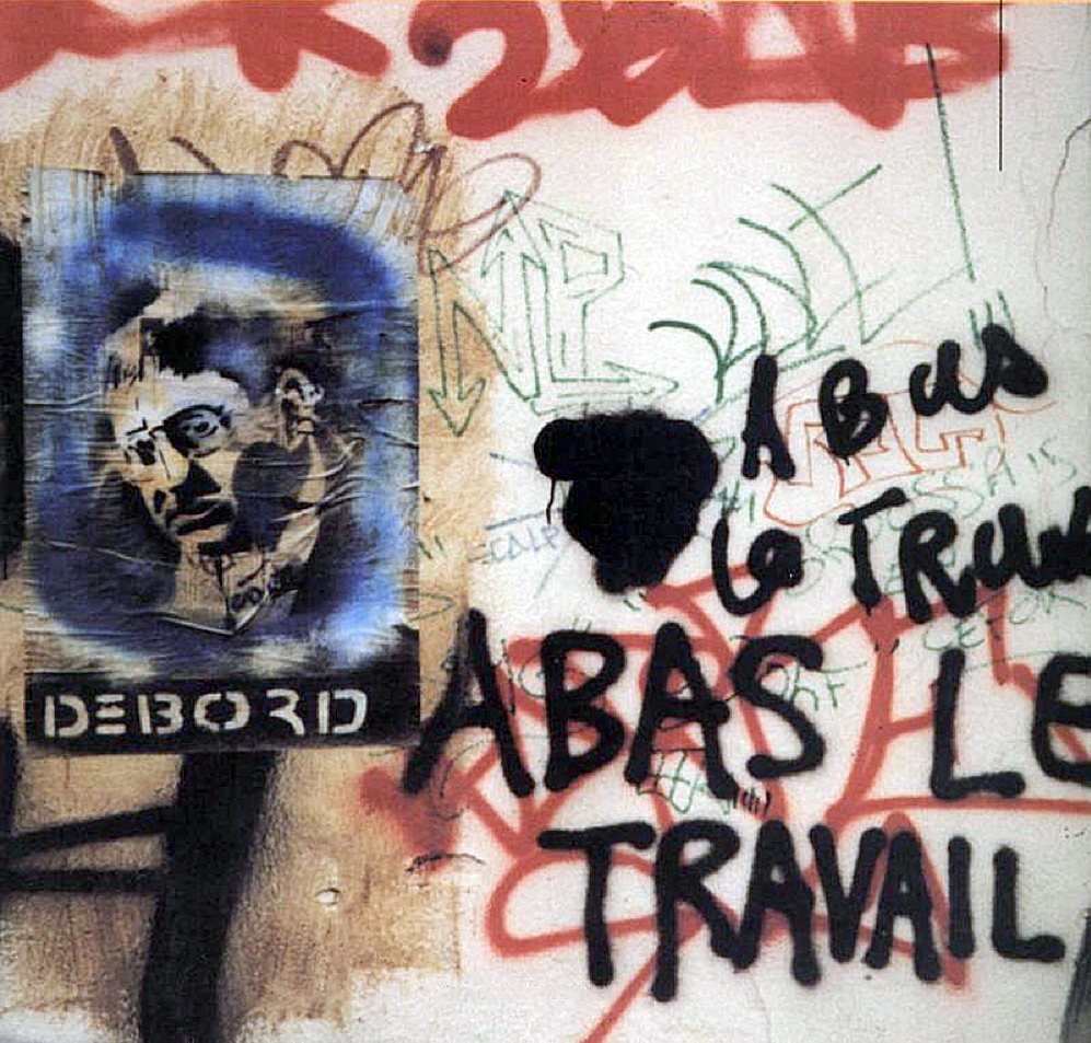
Matt: “The redacted graffiti was interesting too. Just the fact that Lionel saw that it was redacted, rather than just painted over or censored (as I would have put it!). It shows the way he looks at the world in quite a different way”

I like this comment because it again relates to my desire to find and reveal the visually interesting in the seemingly mundane, and I’m glad that comes across. I’m trying to say, “you don’t need to go to an art gallery, just look around you.”

In an indirect way, this reminds me of something Franz Kafka said, which I like:

“You do not need to leave your room, remain sitting at your table and listen. Do not even listen, simply wait. Do not even wait, be quite still and solitary. The world will freely offer itself to you to be unmasked. It has no choice. It will roll in ecstasy at your feet.”

It also reminds of when I was studying ‘A’ Level Art (at about the age of 18). We did a lot of painting and drawing – and after a whole day spent drawing still-life I was amazed at how my visual awareness and perception (consciousness even?) was heightened when leaving the classroom. I would become consciously aware of small details, like highlights, shadows and textures on everyday objects that I might otherwise have overlooked. In this sense almost anything can become visually fascinating. And in choosing my subject matter I want to combine this kind of observation about visual perception with a relatively discreet anti-elitist ethos underpinning the work.

ArmedYouth

Terry: “The children crossing sign is the one that did not work for me. Is it saying no to guns, or is saying yes? Maybe it should have a diagonal line though it.”

Jonathan: “Terry - yes the question is, is that image (children with guns) a semiotic symbol - what is it trying to do? Be a warning or describe, it is obviously using the form of the triangle warning sign in Britain, but for what purpose?”

Somehow, I had a feeling that Terry might not like this one! I can see how some might find it distasteful – but that is partly the point. Am I advocating the arming of children? Of course not! I’m describing the reality of life for many young people in inner SE London. (The Institute for Economics and Peace recently listed Lewisham as the ‘least peaceful’ place in England and Wales, followed by the nearby inner London Boroughs of Lambeth, Hackney, Newham and Tower Hamlets. It also said that knife crime is a particular cause for concern amongst 13-24 year olds.) Equally, I don’t mind if this piece is somewhat ambiguous (‘mysterious’?) – and so to answer Jonathan’s question, it is both a warning and a description. I think to put a diagonal line through it would ruin it and really reduce its impact. The whole point of the ‘gag’ is that you might see this sign as you pass through the area, warning you of ‘Armed Youth’ ahead!

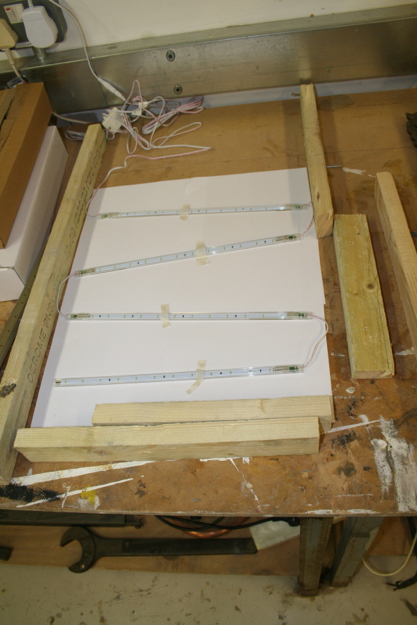
Jonathan - “technically I do think there are some real possibilities with the light box idea and the colour changing to reveal different elements, that has some real potential I feel … it uses the layers effect but adds a different dimension”

I feel the same and also think this could lead to something quite unique and am looking forward to experimenting with this!

Laila - “I love Lionel's work very much and the ideas he is presenting in a simple way. And I do love that road sign with the kids;it hit me :) I find it very strong but I honestly would love to see more of his personal touch in the work.”

This is an interesting comment, and I know what Laila means. But on the other hand, in the presentation I stated “my intent in using primary source material from the wider world around me” (I was also originally going to add “rather than indulging in self-obsessed navel-gazing” – but I didn’t want this to be misconstrued as an attack on other students, who may be more focussed on the personal!) Anyway, I wonder if there might be a way to reconcile these seemingly contradictory directions?

I want to stress that I do not necessarily condemn art or artists who focus on their inner, personal selves – or who produce work that might be very difficult to ‘understand’. For example, I like abstract minimalism and believe there is definitely a place for art which experiments purely with form and aesthetics. I even quite like how Anish Kapoor says, “I’ve got nothing particular to say, I don’t have any message to give anyone” and I think most of his work is great (with the notable exception of the Olympic ‘Orbit’ tower!). This is partly because he generally manages to produce work which, while starkly abstract, is highly engaging. For example, at his big 2009 show at the Royal Academy, it was great to see how even the littlest kids excitedly interacted with the highly-polished steel sculptures.

KapoorRA2009

(For more on this see: http://anishkapoor.com/252/Royal-Academy-of-Arts-2009.html .) At the same time, were they just a sophisticated ‘hall of mirrors’ – and just as superficial? Personally, I think some of the very best art combines brilliantly executed formal experimentation with something clear and engaging to say (even if this is just implied). It also balances aspects of the inner personal with being actively concerned with the wider world and society. Perhaps that is partly my conditioning as a designer, but at least for this MA, I think that is the kind of direction I’m aspiring to take – and I will try to work within these parameters.

Jonathan: “…take it back to the streets!”

Matt: “shopping centres, youth centres, subways, rooftops. The actual places he's depicting and telling stories about. think that would work really well.”

The idea of installing these pieces in public spaces is something I’ve discussed with Jonathan in tutorials too and I think there is probably potential with this and something I need to consider further. (It’s also something I’ve actually done before too.) I agree it could also help add depth and further layers of meaning etc to the work.

Laila: “I think Lionel has big potential, hope to see more courageous experimentations”

Ok Laila, I promise I will try to be more courageous!

Thanks again for feedback everyone!

Attention Seeker

For the last couple of weeks I’ve been working on a painting titled ‘Attention Seeker’. As I said in my previous post from my tutorial notes this was originally digitally designed as a vector illustration, and is something I’ve wanted to create an ‘analogue’ version of for some time. AttentionVector1_1000px

I amended the design in order to ‘make it make-able’, rearranging the triangles into a more ordered tessellation. This is because each stencil is held in place by three pins at each point of the triangle. I prepared the final artwork and cut out the stencils using the college’s laser cutter.

AttentionVector1000px

While I intended to paint this directly onto a large  (80x60cm) canvas I decided to do a rough version (or I guess you could call it a ‘study’) on cardboard first. I’m pleased I did so as there are a few things I would change for the ‘final’ version.

IMG_9844

It was good to see what a difference it makes to see the image emerge using real paint and at a large scale. Since I am using metallic and fluorescent paints the effects this gives in different light conditions is impossible to see on screen.

IMG_9849

IMG_9854

Part of the point of this piece is to illustrate the dichotomy between “…fixed/fluid; precision/accident — and preconceived (tightly controlled, digital vector illustration) as opposed to random (messy, drippy, analogue)”. I’ve been thinking a lot about this while making it and realise how controlled much of the ‘random’ elements remain.

IMG_9861IMG_9872

IMG_9900

IMG_9906

In particular I discussed with Jonathan whether or not to add drips, so I decided to do a ‘before and after’ to help make these decisions.

Attention1000px

Attention3_1000px

Project Proposal 1.1

[ This was written to present to the weekly chat session for online students. As such, it’s a brief version of a longer and more finished proposal which I’m still working on. My thinking was that I need to focus on a particular subject and many of the other concerns outlined in my first project proposal can be addressed more through formal experimentation. ]

I’m working with everyday (and seemingly mundane) images, texts and objects from the urban environment – specifically from inner London. In doing so, I aim to:

• reveal the visual qualities of the often decayed and distressed nature of such subjects, and question conventional notions of beauty and ugliness;

• supersede the idyllic, rural subjects of traditional landscape painting with those of urban street life;

• celebrate working class and popular culture, and challenge elitism;

• validate the intrinsic aesthetic value of the inner city, while simultaneously highlighting its problems, such as poverty and alienation;

• address global questions about the relentless shift of populations from the rural to the urban and the increasing expansion of megacities;

• reflect upon my personal journey as a young man from a small town to the big city.

I’m using digital photography (as well as found objects, texts etc) and combining various print and handmade techniques to create multilayered, multi-coloured pieces. I’ve recently been looking into using lightboxes too.

I’m also considering how to include elements of video, interaction, social engagement (perhaps through crowd sourcing) and public installation as the project develops.

Let’s make the ordinary extraordinary through the transformative power of the creative process!

Above all I aim to make work which generates an emotional response in the viewer.

Some portfolio pics

Below is a selection of 15 images I submitted in support of my application to the MA course. In general, I selected projects which show a greater degree of self-authorship – and have been exhibited in a more artistic context – than my usual design work for clients. Accompanying captions also explain each piece. Hopefully they should also provide a good general visual introduction to my aesthetic concerns and help illustrate some of the ideas touched upon in my first project proposal…

http://www.flickr.com/photos/lionelopenshaw/